
To keep myself fresh with CSS, I searched for design inspiration, and implemented this. It’s an imaginary SaaS product called “chunky” that lets users manage something Minecraft-related, perhaps game server hosting.
This uses CSS (especially SCSS/Sass, the CSS compositing and blending module, and CSS animations), semantic HTML, responsive layouts, and React.
Flexboxes and line-height
A lot of care was put into aligning everything just right, espcially leveraging the CSS baseline. Look at the navigation bar at the top. Despite varying element height, varying font-size, and several nested flexboxes, all text ends up at the same vertical baseline.
Except the “chunky” logo; it just looks better shifted down like that.
Knowing how to leverage line-height is the key to vertically aligning wildly different texts.
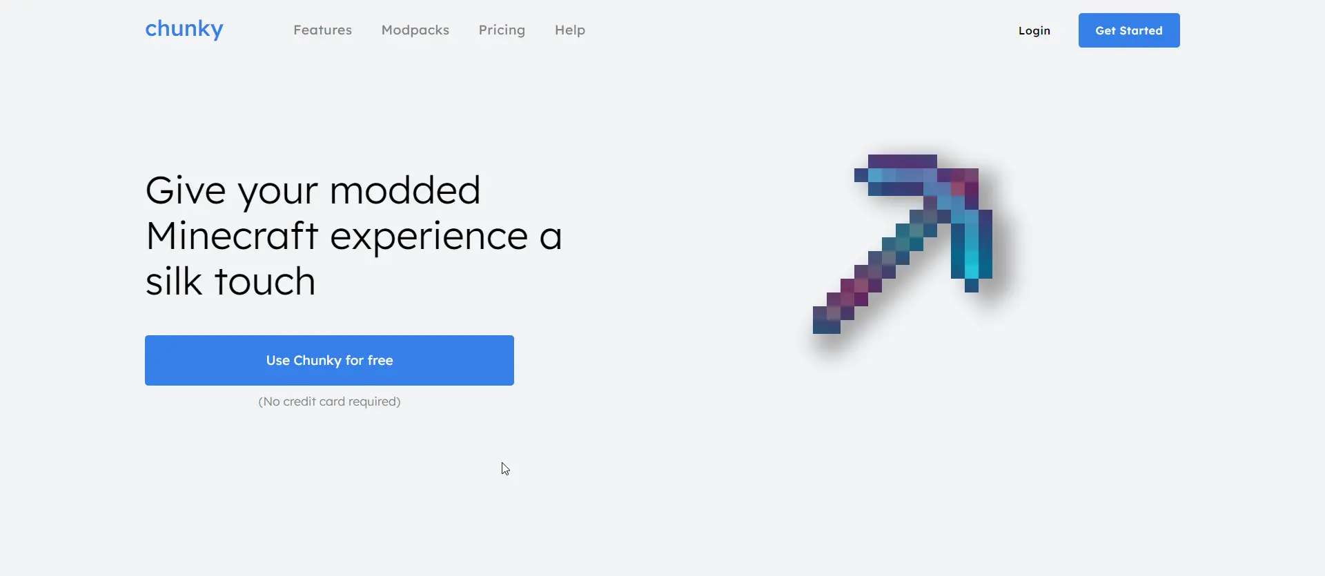
The pickaxe
The enchanted pickaxe is made from two elements, a foreground and a background. They occupy the same bounds.
The foreground is more interesting. It has two comma-separated values for background-image: in front, a repeating-linear-gradient, and at back, the source image of the pickaxe. The gradient in particular is at a slight angle and is made of two translucent colors (in an A-B-A pattern, so that it repeats smoothly). However, as described so far, the gradient would render the entire bounding box of the element, so I needed another trick to make the gradient take the shape of the pickaxe: It uses the mask-image CSS property, which let me re-use the already-loaded pickaxe image as an alpha mask. Finally, the gradient is then animated by alternating between two background-positions.
I had to expand the gradient downward since repeating-linear-gradient defaults to rendering a texture only the size of its element, so scrolling the gradient in any direction reveals a nasty seam. Also, mask-image is vendor-prefixed, but thankfully SASS took care of that by itself, and the effect works in all browsers tested.
The background re-uses the pickaxe image a third time, running it through several filter functions, resulting in a nice grey shadow.
Conclusion
It’s a nice design, but it could use some more art, and I could flesh out the page with more sections. I don’t plan on turning this into an actual Minecraft product, of course. I deployed this to Azure Static Web Apps using GitHub Actions, though because I am cautious with runaway bills when using cloud services, I won’t link it here. You can see this (design-playground) and other projects of mine if you visit my GitHub profile!